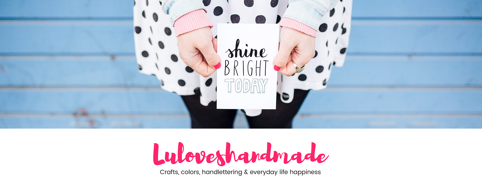
Hello everyone! Yippie yippie yay, my blog has a new look! It has been two years since my last blog makeover and now it was time again.
See yourself what has changed and get insights into my redesign process. :)
First step – new photos:

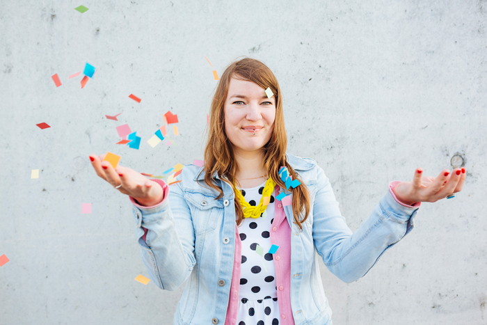
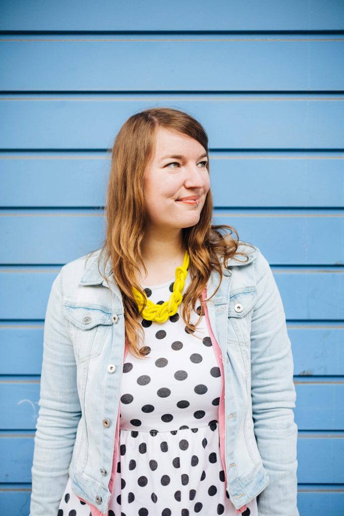
As a very first step, I briefed my pal and fave photographer Alexander Rentsch and spent one day with him taking photos for my blog, social media channels and professional portfolio. He made all my wishes come true and I am so super excited and happy about the results. Above you can see a selection of the photos I finally chose.
Choosing fonts:
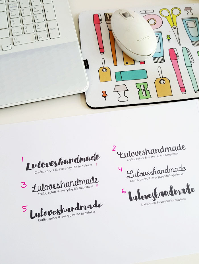
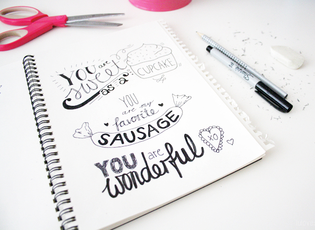
To change my blog’s overall look, I wanted a new logo font. Due to my love for handlettering projects, I decided to take a font with a handwritten look, bought several ones and tried out a few favorites.
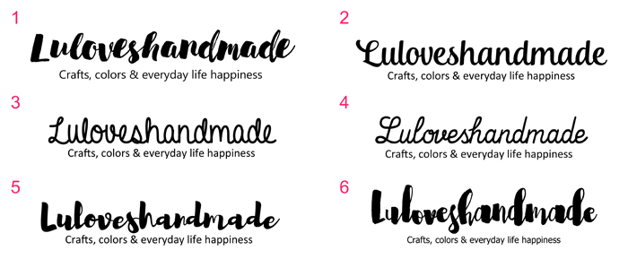
To make the choice easier, I also asked my friends and let them vote for their fave ones. Super helpful.

When I chose two final fonts, I made drafts for the overall blog, already building the header and some other elements, and also for my new business cards in order to find out which version I like best. I then decided on the right font. I like it a lot.

For my new business cards, I chose the confetti photo as main element, made a first draft and my bestie Anja who is a media designer later reworked it and made the final print file for me, eeeeks.
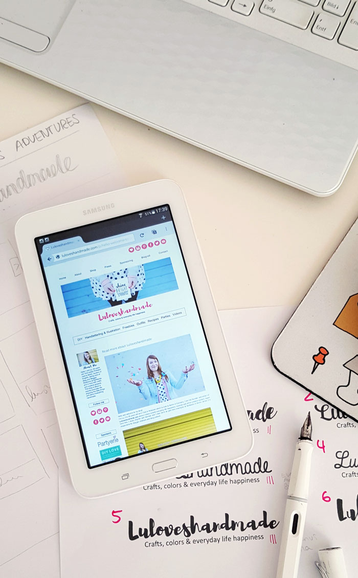
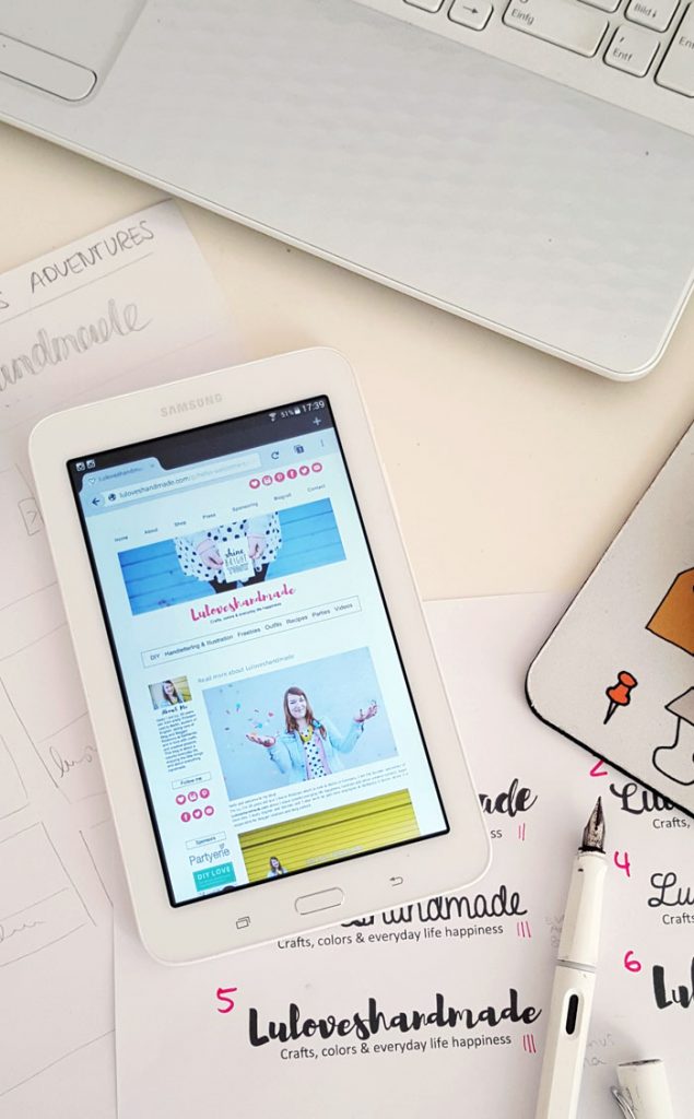
The makeover:
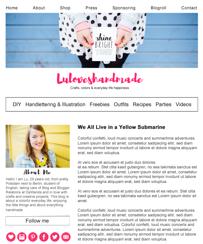
After choosing the fonts, color concept and main visuals, I made all elements in photoshop and implemented them into my blog step by step. I loved doing this process all by myself. And in case there were technical problems I struggled to overcome, my friends Sina and Anja were always a good help! :)

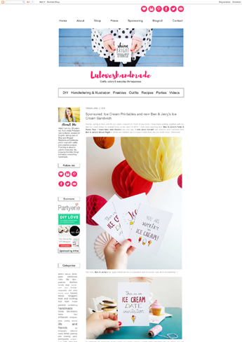
So here you can finally see the difference and the final result: I chose new fonts and a new color concept, decluttered the sidebar and the pages and added two new sites (handlettering & illustrations and freebies) with project overviews. Moreover, I implemented new photo material, updated my ‘about’ page and reworked my media kit with more detailed information, a look fitting my new blog concept and a visual overview of past cooperation partners.
New Business Cards:


Then, I finally got my new business cards printed: the front side’s look is dominated by the new logo font and the pretty confetti image, the back side is printed with contact details. Anja and I chose white cardboard with a soft feel and look. Makes me so happy.
And for you to compare, here are the three generatrions of my business cards I had so far. :)
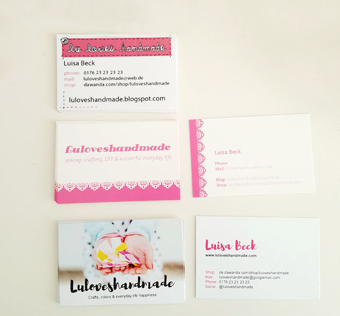
When looking at them all together, I think I still like the first one (which is about six years old) even better than the second one. It has more personality and better contrasts. It’s fun to see how some things change and some always stay the same.
So that’s it, new blog design, new overall look, but still Luloveshandmade. I’m happy and excited. Thank you for being part of my journey! :)
Lu
das neue design ist wunderschön :D passt perfekt zu dir und ist trotzdem noch ein bisschen verspielt <3
mir gefällt's total gut .! es spiegelt deine bunte lebensfreude total wieder und ist gleichzeitig nicht zu viel oder zu kitschbunt ..der post ist übrigens soo toll . ich liebe es zu sehen welche arbeit hinter so einem wechsel eigentlich steht und wie das design entsteht .! total interessant ..darf ich fragen wie die font heißt . die ist so schön :)alles liebe und ich wünsch dir lange viel freude mit deinem neu kreierten design .! wunderbar gemacht ..liebe grüßedie sarah
WOW, total toll geworden!! Ganz großes Kompliment!
Yay! Herzlichen Glückwunsch zum neuen Look! Sieht super aus. Und wenn man die alte CI betrachtet merkt man ganz deutlich, wie neu und frisch alles geworden ist! Mir gefällt es richtig, richtig gut!GLG und ein schönes langes WEJohanna
Diese Farben! Der neue Look ist großartig!Papagena
Liebe Lu, wunderschön geworden. Gefällt mir richtig gut. Die Visitenkarten sind auch super geworden.LG Steffi
Yeah, das neue Design ist richtig, richtig toll! Die Typo gefällt mir auch am besten und insgesamt sieht es sehr strukturiert und aufgeräumt aus – aber auf eine gute Art und Weise :) Die Visitenkarten gefallen mir auch sehr. Woher hast du die denn?Liebe GrüßePetra von http://www.anothercopycat.com
Tausend Dank Euch, ich freu mich SEHR!! :)
Gamuda Gardens+Biệt thự Gamuda+Liền kề Gamuda+Biệt thự song lập Gamuda+Biệt thự đơn lập Gamuda+Chung cư The Two Gamuda+dự án gamuda city
Wow, das ist dir echt super gelungen! :)Aber es ist doch immer erschreckend, wie viel Aufwand hinter so einem neuen Aussehen steckt, bis alles passt… mein Blog müsst auch mal wieder eine Generalüberholung abbekommen – zwar nicht das Design, aber die Seiten, das Archiv, die Posts…Liebe Grüße
It's so clean and elegant! I loved it.It's easy to search, to read, to understand.Very sweet! ♥
Very nice post. Thanks for sharing such a useful post.cleaning equipments in chennai
Thank you for this post. That’s all I am able to say. You most absolutely have built this blog website into something special. You clearly know what you are working on, you’ve insured so many corners. Thanks. WordPress portfolio theme